No items found.
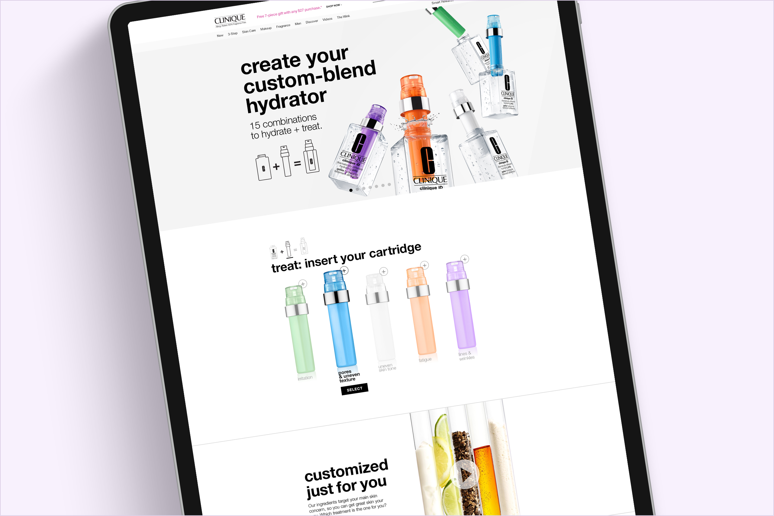
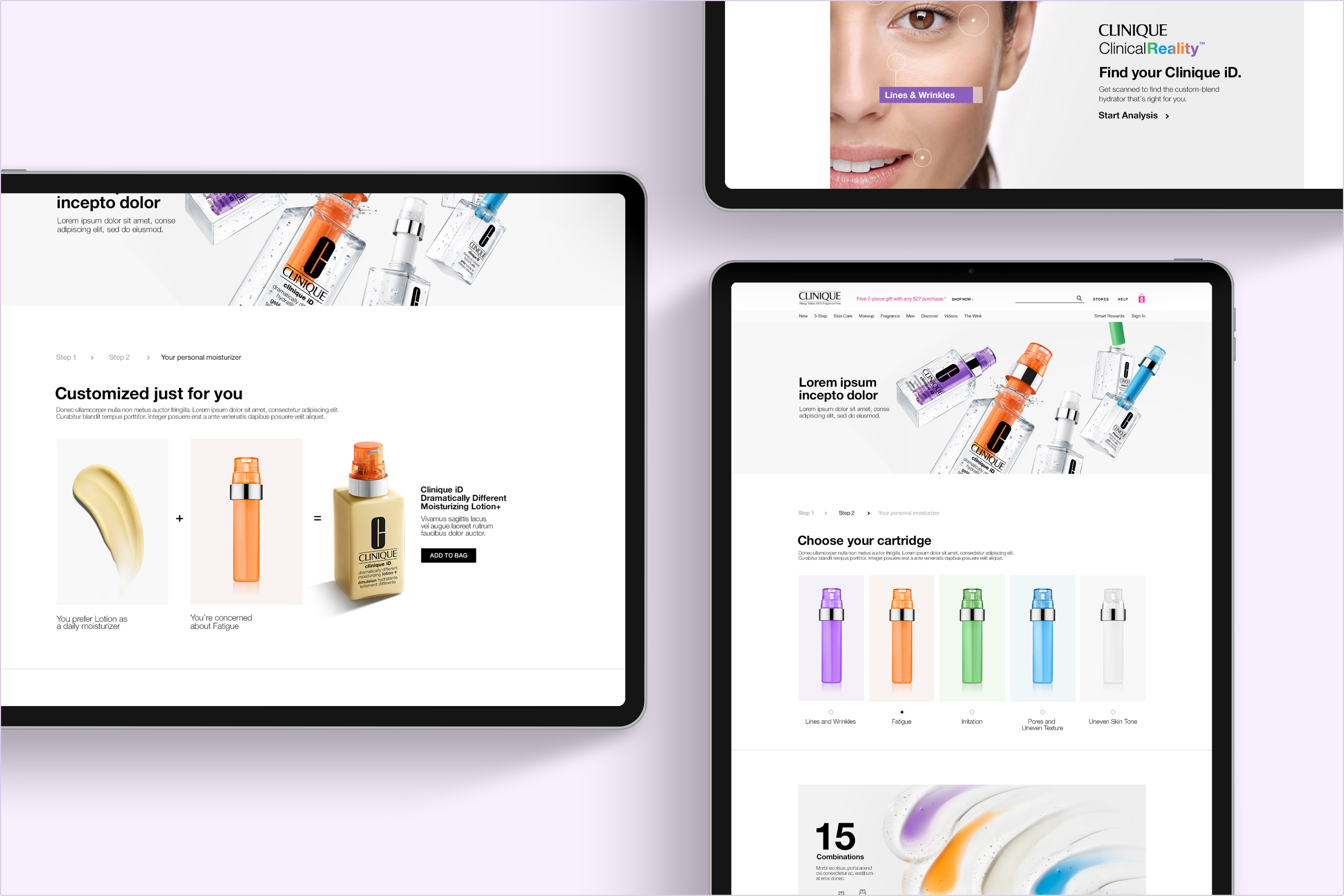
For the launch of Clinique iD, the goal was to design an landing page with a new interactive module that showcases how the new product formulation and technology works.
Clinique's Creative Director's initial main focus was to create something that was visualy interesting. Although, that would change once the marketing team got involved, I jumped right in and started exploring the different ways we could present the information in a way that was both visually impactful and engaging for the user. For the overall layout, I decided to break up the usual full-width modules, and create a grid of information where the user could get a quicker grasp of the formulation, with imagery and typography as a driver for visual impact.
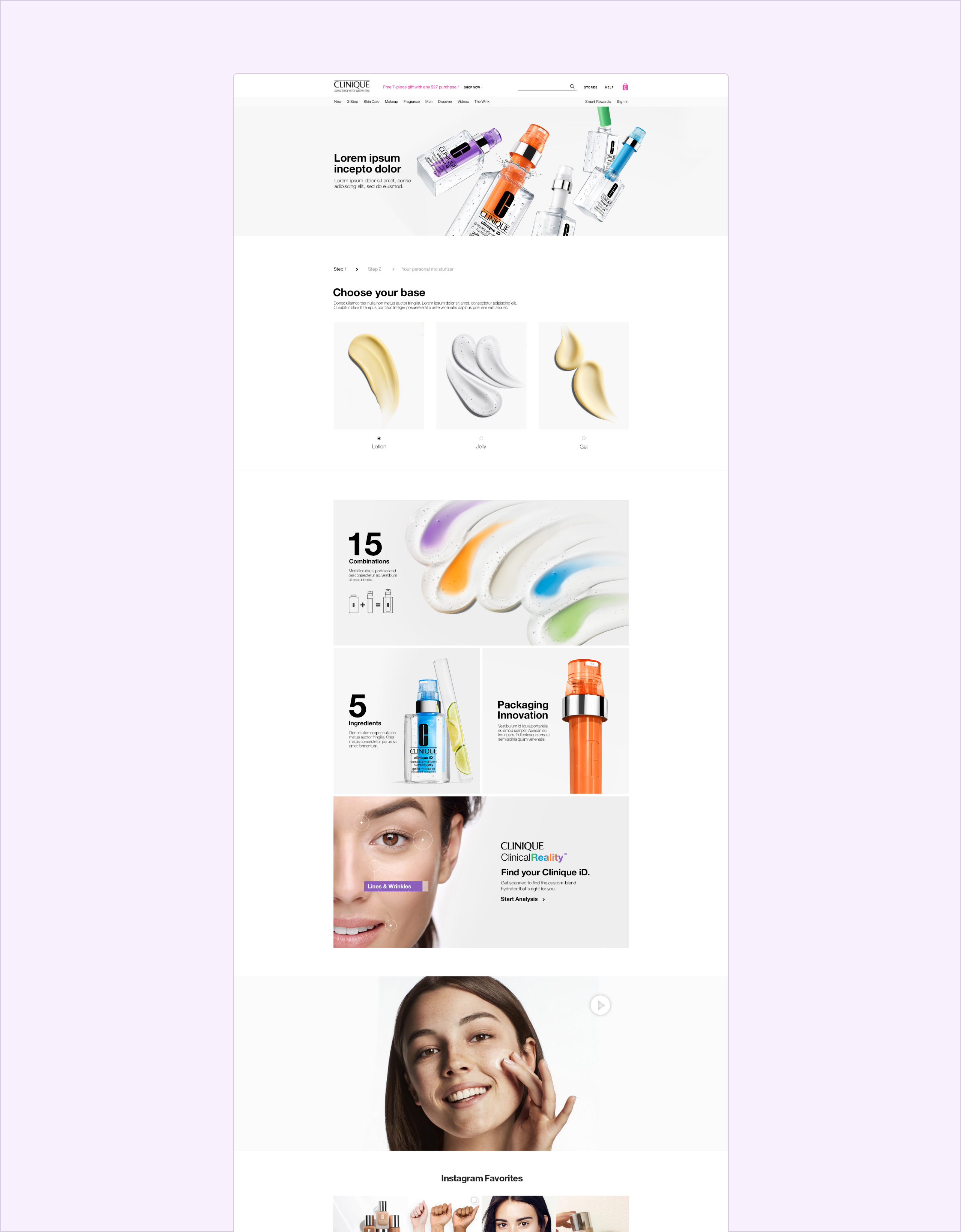
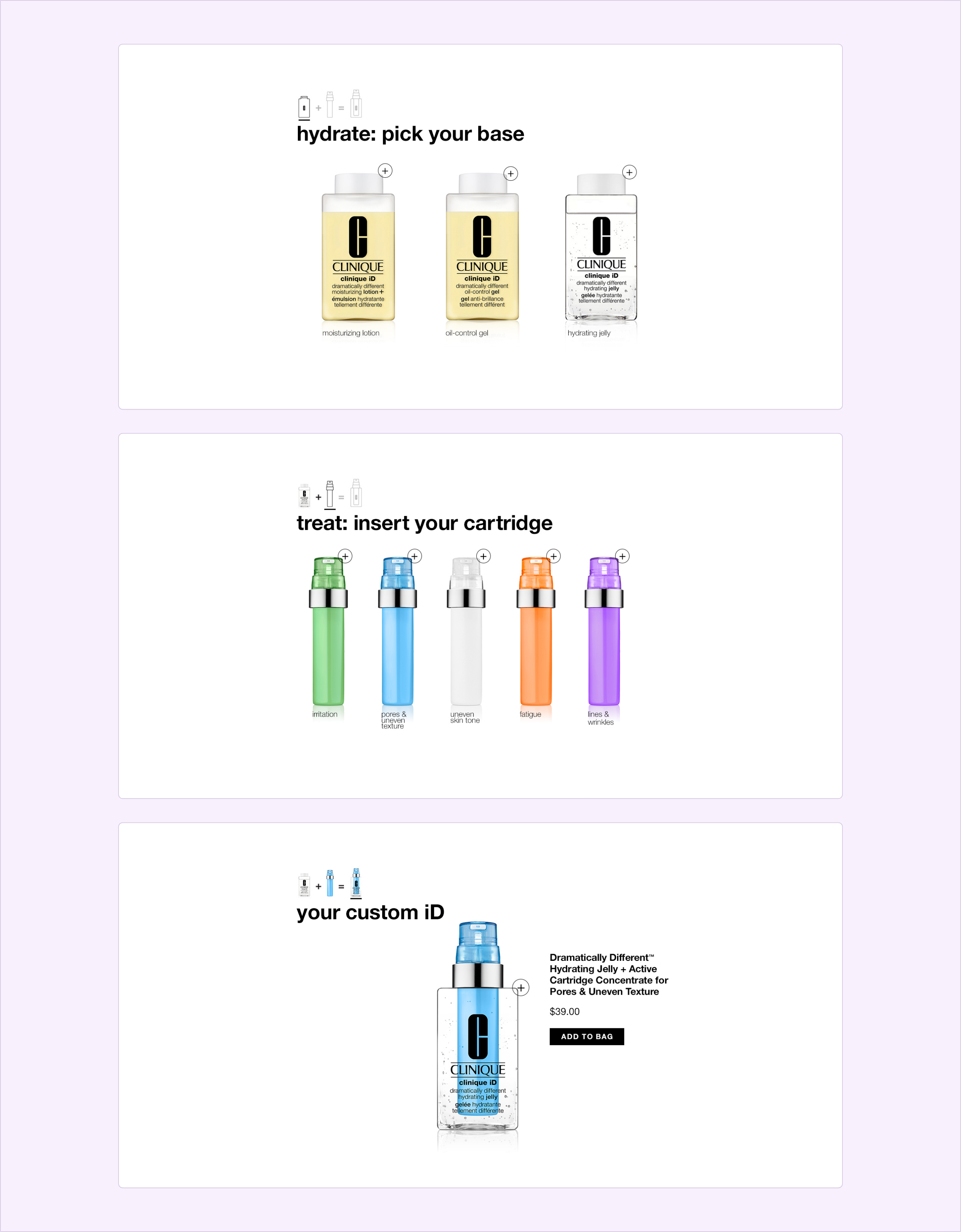
For the main interactive module, just like the overall page the goal (atleast initially) was to create a something that was more interesting than clinique's usual modules. Here I began exploring different layouts and user exeriences. As for user experience, I wanted it to be as easy as the new Clinique iD icon expressed it. Essentially, as easy as 1-2-3 with the end goal of having the user make a purchase.
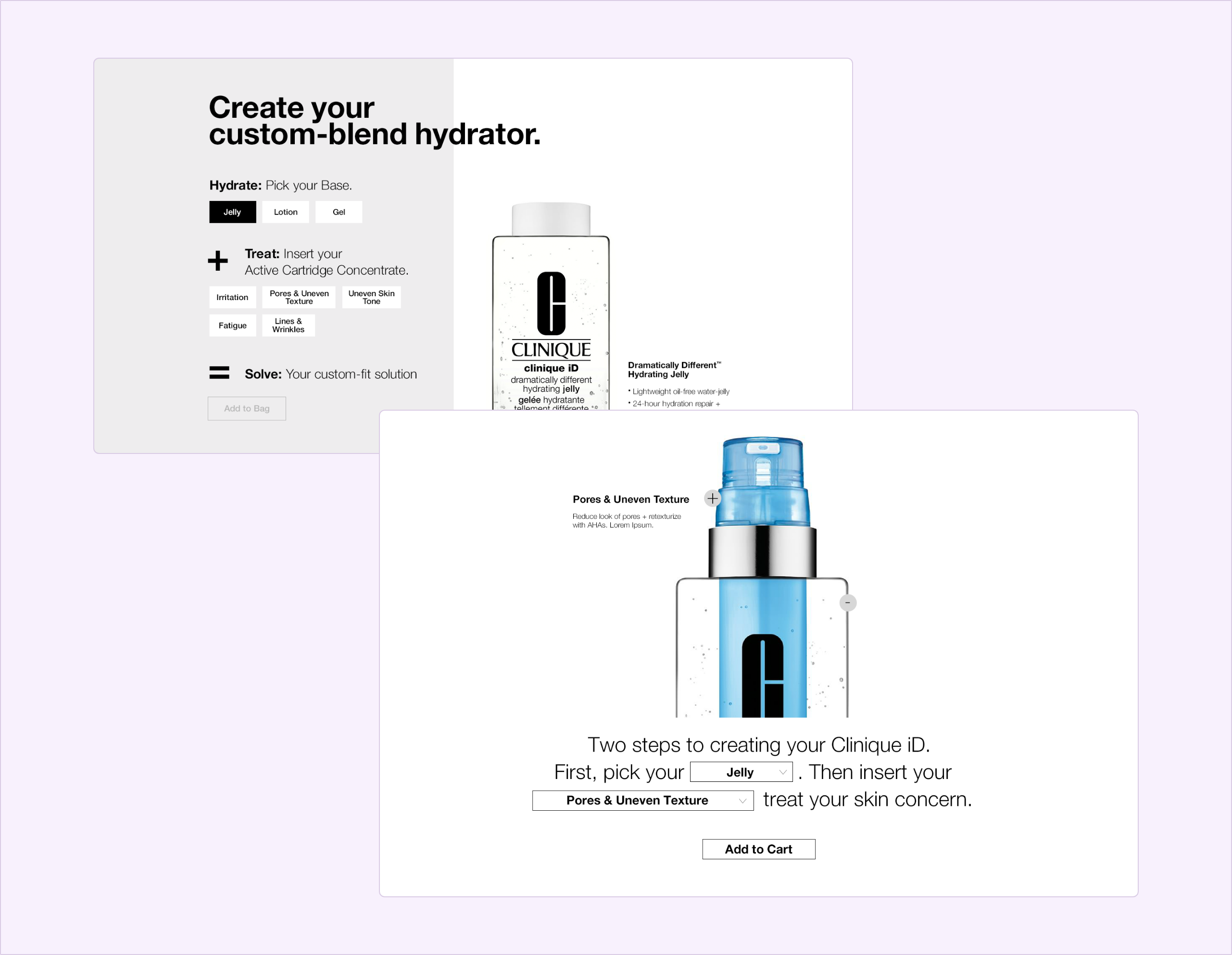
As I've mentioned, early on client stakeholders had one thing in mind while others were on another page. The aim became to make the entire page feel as easy as the process itself. So visually we stripped things back and went with clean white and chose imagery that contrasted and flowed nicely throughout the page. This also went for the interactive module. We also learned that the development teams had some limitations, which meant we needed to keep the information on the page in Clinique's usual fullwidth module format minus the new interactive module which was the main engagement.
In the end, we landed on a soultion that was true to Cliniqu'es brand and represented the new product in a very engaging and easy understated way.